Please click to view my evaluation:
http://prezi.com/2nnkwad00ixh/evaluation-of-media-coursework/
Sunday, 24 April 2011
Friday, 22 April 2011
Idea for my Evaluation
For my evaluation I had an idea to do a post-it note presentation showing all the information briefly and maybe speaking in the video too. Another idea was to use prezi to create my own video and add it post-it notes to it, just slightly simpler and more entertaining.


Making changes

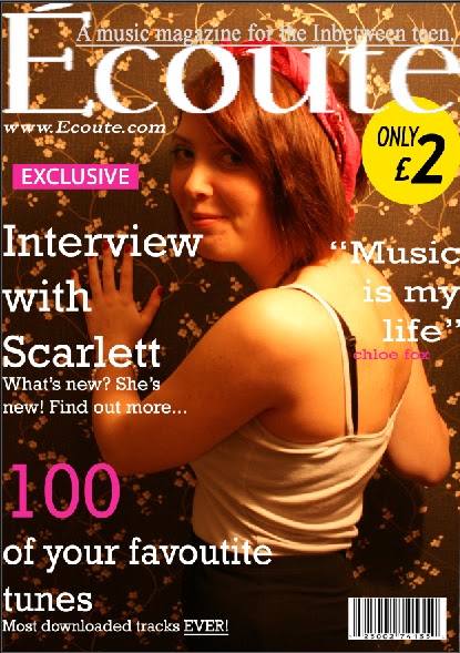
Changes to my front cover

Here I have added both of my front covers, before and after the final editing. The cover on the right is how it looked before I made the changes. Over all I have changed quite a few things based on the feedback I was given. I decided to keep the same picture but lighten the background to pinky colour which fits into the colour scheme better than the dark brown on the previous cover did. Although you might not be able to see it on here, above the barcode I have added a issue number and a date. I changed the strapline slightly however this was difficult to find a colour that fitted the colour scheme but at the same time didn't blend into the background, this is the reason I have stuck with white. I aslo added a competition to my front cover as before this area looked blanked, as if it needed something there. I am happy with the improvements I have made to my front cover and think that it is suitable for my target audience.
Thursday, 21 April 2011
Overall feedback
Front Cover
I have been told that my front cover is strong but there are a few things that need changing...
-Possibly change the colour of my strapline and move it up slightly so its more visable.
-Put an outline around the masthead to neaten it and also make it stand out more.
- Add a date and issue number.
-Add some more text and change the layout slightly.
Some people also mentioned about the background colour wasn't usually what you would see on a front cover and it may look better if it was a lighter colour that matched the colour scheme.
-Check spelling and punctuation
Contents
Iwas told by a few people that my contents is my strongest page and only need minor adjustments to it. A strength of my contents is the ways it's set out.
- I need to add page numbers to the contents however.
Double page spread
I need to make some changes to my DPS to make it stronger...
-Add page numbers
-Add a caption box in the corner of the main image, just a few words to sum up the picture overall.
-Add a title to the picture for example, exclusive/ cover star etc.
-Change the text layout and add some more text.
-Put frames around the snap shot pictures, add clip art.. maybe paper clips or old style photo effect.
Thursday, 31 March 2011

Sunday, 27 March 2011
DPS 1
 This is the first rough idea for my DPS as I have been trying out different ways of setting it out. I firstly startted off by choosing my image that I wanted to use. I chose one with the same background as the front cover. For a while I tried moving things around and adding in text but it just didn't look right.
 Friday, 11 March 2011

Stages of my contents page

This is the first stage of my contents page. I added my magazine title logo to the top right hand corner. I also chose the same font as my front cover to write contents along the top. I then added in the picture I had wanted to use on the contents page.
The second stage I then added a cirle to create colour on the page. Also this was to add a letter on it from the editor. I changed the colour of the text as obviously pink wouldn't show up on the circle. I added a line across the top with the date/ month. Then I added a page number on the picture.
The third stage I added text to the circle and also a picture of the "editor". I added a line to put "on the cover" on and then I can write underneath about the things that were on the cover.
The fianl stage was just simply adding text and what was going to feature in the magazine.


Tuesday, 8 March 2011
Final Front cover
This is my final magazine cover, I added much more text to it. I have focus on keeping it to simple coulours. I went with mainly white and pink because it matched the main cover image. However i did the sign in yellow as I wanted this to really stand out to the target audience. On the cover it shows that Écoute has it's own website. I have highlighted the word exclusive, putting it on a pink background because this is the sort of thing that will really draw the readers attention. 
Stages of making my magazine
 This is the first stage of my magazine. I choose the picture that I wanted to use and zoomed it in so that there is more focus on the image rather than the background. I aslo added in the heading which I made on dafont.com. Then I wrote in my strapline about the heading.
  This is the secound stage of making my magazine. I then added in a website below the heading. Also I made a price sign.
This is the third stage of my magazine. I added the barcode and all added all the text, this is not the finished image. To finish I added more and more text.
Sunday, 27 February 2011
Photography for the magazine

Monday, 7 February 2011

Thursday, 27 January 2011
Analyse of a Contents page (men's lifestyle)
The magazine I have chosen to analyse is FHM.
The magazine has been in publication since 1985, the magazine was originally published as For Him magazine but changed its name to FHM in 1994. It's a monthly men's lifestlye magazine.
Like the Glamour magazine FHM is set out over two pages, allowing the information to be more spread out with more detail as to what is on each of the pages. However on this magazine FHM is not written at the top of the magazine instead the reader is informed that this is the contents page and also the month of the issue. This contents page uses the same model as the cover, except a different style of image. This image takes up most of the first page, at the bottom the reader is told where to find this page in hte magazine. The language is obviously aimed at the male reader by the way she is described to the auidence.
The way this page is set out is much clearer compared to Glamour magazine, the page number is there is bold red along with what the page is aobut is bold black. Then you are given a brief piece of information as to what the article/ page is about.
I have noticed that at the bottom of the page, the Bauer icon is printed, this is the company that own and publish the magazine.
On the second page the information is far more brief with just page numbers and what is on that page. Again half the page is taken up by a picture of a half naked women, the page number is given in the bottom corner of this image. Overall, womens magazines have more information on them compared to a mens magazine. FHM only uses two main images but these are the main focus of the page. There is a colour scheme of yellow, black, white and red but this does not match with the cover style.
Analyse of a Contents page (women's lifestyle)
For my womens lifestyle magazine i have chosen to look at Glamour mag.
 The contents in this magazine is set out over two pages but they both seem to include more text than pictures. The first page only has one picture, however this is the main focus of the page. This then includes text by the side of it to tell the audience what the article is about. The Glamour title is again printed at the top like on the front cover and below it says the date. A web address is also included on this page which is a great way of letting people know about there website along with getting more viewers.

 The contents in this magazine is set out over two pages but they both seem to include more text than pictures. The first page only has one picture, however this is the main focus of the page. This then includes text by the side of it to tell the audience what the article is about. The Glamour title is again printed at the top like on the front cover and below it says the date. A web address is also included on this page which is a great way of letting people know about there website along with getting more viewers.
 There is a colour scheme throughout these two pages. On the first page it all fits together nicely, the outfit chosen on the model even matches this colour scheme. The main pieces of information are in bold colour whereas the other text is all in black.
The headings above each section make it clear as to what its about and whether its been featured on the cover etc.

On the second page again the title, month and website are repeated at the top of the page, this time slightly small so less focus is on this. This page includes more image but these are small than the one on the previous page. Half of the page is a competiton of winning the cover girl's look. The other half is layed in in the same way as the last page. It usings bold coloured text to make these things stand out from everything else. The desrciptive writing is usually done in black.
Overall this contents page is there to give you the basic information as to what is featured throughout the magazine.
Sunday, 9 January 2011
Double page spread
In style magazine
I have chosen a double page spread from in style magazine which again focus' the page mainly on the image. However on this page there is no colour, its all done in black and white. The image is in black on white and the background all is suitable for this. The font is black and stands out to its audience. Most of the page is taken up by the title 'Shining Stars' along with short a description of what its about.
I have chosen a double page spread from in style magazine which again focus' the page mainly on the image. However on this page there is no colour, its all done in black and white. The image is in black on white and the background all is suitable for this. The font is black and stands out to its audience. Most of the page is taken up by the title 'Shining Stars' along with short a description of what its about.
Thursday, 6 January 2011
Contents Page.
In style magazine
The In Style magazine contents page does not use the same colour scheme as the cover however it is still similar. They have chosen the same person to model on the contents though. The issue number and date are printed very small at the top of the page. They have used the masthead again at the top of this page however half of it is covered over by the model. Many magazines appear to use this technique, often because customers would already recognise the masthead and title by its font and layout.
The first things of which they have focused on is what is on the cover of their magazine, this is what the reader is likely to be most interested in. It is set out very clear to the reader of what they want and where they'll find it.
I have chosen to again look at in style magazine because my target audience is women and i would like to base Ecoute (my own magazine) on magazines such as, smash hits, vogue, X magazine etc.
I have noticed on this page that they have not used the same font consistently but instead used a variety of fonts. The numbers of the pages are all done in the same font and so are the headings and description of each page.
The page all includes a box all about your own look so readers will know about it and want to read more about it. Another noticable thing on this magazine is a the bottom they have advertisied a subscription to In Style magazine, this is a great idea as it then guarentee's readers for 12 issues. This stands out as it is done in a black bow at the bottom but it does still fit the colour scheme of the page.
Double page spread.
Q magazine
I have looked at a double page spread in Q magazine, I have chosen a page on the Artic Monkey's. The main focus of this page is the picture which takes up around 3/4 of this article and the readers attention focus's on that. Part of the picture overlaps onto the next page which i feel looks quite good along with a big S for the start of the sentence. The picture is not posed for as the Artic monkey's are here seen in casual jeans and t-shirt, one of the holding a starbucks, another playing with a football. The picture is an old picture however back from 2005.
The main title is PARKLIFE and belong it gives you an outline of the Artic Moneky's, how it all began. In the corner we are given a ltitle description of who is in the picture along with some other details, like a caption.
The text on the next page includes a story of the artic monkeys, the language is quite informal but as if someone is telling you the story themselves. However it is clear from the language that is used that it's aimed at an older reader. The page is set out almost with two long columns of texts however it is broken up with facts in the middle of the page. It also includes studio notes in the corner. I have also noticed that the Q logo is included on every other page.

Content page
Q magazine
When you look at this contents page it appears to be very structured. The main articles which are likely to attract it's target audience are on the first contents page. Page numbers are indicated in bold font so that its clear to the reader where and what you will find.


The contents page of Q magazine matches the colour scheme of the front cover. It stands out to the reader that this is where you can find all the information about this magazine. It is made clear at the top of the page what issue number that this is. Also in the top right hand corner is an image of the front cover.
When you look at this contents page it appears to be very structured. The main articles which are likely to attract it's target audience are on the first contents page. Page numbers are indicated in bold font so that its clear to the reader where and what you will find.
On the first content page, two images are included, both being of bands. On the main image a page number stands out in the bottom left hand corner, information is also included about this page at the bottom with arrows next to it showing that it links to the picture.
The colour scheme is carried on throughout most of it's magazine that are published, using colours such as red, white and black.
On the second page the articles are all in order whereas the first contents page was the best picks. This page includes more images on the last but there is less focus on the pictures as they are smaller. The page gives you short quick information about the pages.


Monday, 3 January 2011
Masthead

 The title I have chosen for my magazine is ECOUTE, meaning listen in french. To gain ideas I have looked at mastheads on existing magazines. I chose the magazine sugar to look at the style of masthead. The font is very rounded and girly along with the colour choice of pink, this shows that it is aimed at a younger audience. I then looked at a cover from Vogue magazine which uses a similar colour scheme to Sugar, however I wanted to show the difference between the two. Vogue appears a far more mature magazine which is aimed at older women and you can tell this from this way its set out.
Here i have chosen an idea for my own masthead, this is how Iwould like it to look on my front cover. However I would change the colour. I think that this masthead is almost like an inbetween of the Sugar and Vogue mastheads. The font is not too young but again not too formal. I changed my idea from ambition to Ecoute as I felt ambition was not relavent to music and the sort of magazine I wanted to do. Ecoute is a french word meaning listen, I felt this was more suitable.
Subscribe to:
Posts (Atom)