Front Cover
I have been told that my front cover is strong but there are a few things that need changing...
-Possibly change the colour of my strapline and move it up slightly so its more visable.
-Put an outline around the masthead to neaten it and also make it stand out more.
- Add a date and issue number.
-Add some more text and change the layout slightly.
Some people also mentioned about the background colour wasn't usually what you would see on a front cover and it may look better if it was a lighter colour that matched the colour scheme.
-Check spelling and punctuation
Contents
Iwas told by a few people that my contents is my strongest page and only need minor adjustments to it. A strength of my contents is the ways it's set out.
- I need to add page numbers to the contents however.
Double page spread
I need to make some changes to my DPS to make it stronger...
-Add page numbers
-Add a caption box in the corner of the main image, just a few words to sum up the picture overall.
-Add a title to the picture for example, exclusive/ cover star etc.
-Change the text layout and add some more text.
-Put frames around the snap shot pictures, add clip art.. maybe paper clips or old style photo effect.
Thursday, 21 April 2011
Thursday, 31 March 2011

Sunday, 27 March 2011
DPS 1
 This is the first rough idea for my DPS as I have been trying out different ways of setting it out. I firstly startted off by choosing my image that I wanted to use. I chose one with the same background as the front cover. For a while I tried moving things around and adding in text but it just didn't look right.
 Friday, 11 March 2011

Stages of my contents page

This is the first stage of my contents page. I added my magazine title logo to the top right hand corner. I also chose the same font as my front cover to write contents along the top. I then added in the picture I had wanted to use on the contents page.
The second stage I then added a cirle to create colour on the page. Also this was to add a letter on it from the editor. I changed the colour of the text as obviously pink wouldn't show up on the circle. I added a line across the top with the date/ month. Then I added a page number on the picture.
The third stage I added text to the circle and also a picture of the "editor". I added a line to put "on the cover" on and then I can write underneath about the things that were on the cover.
The fianl stage was just simply adding text and what was going to feature in the magazine.


Tuesday, 8 March 2011
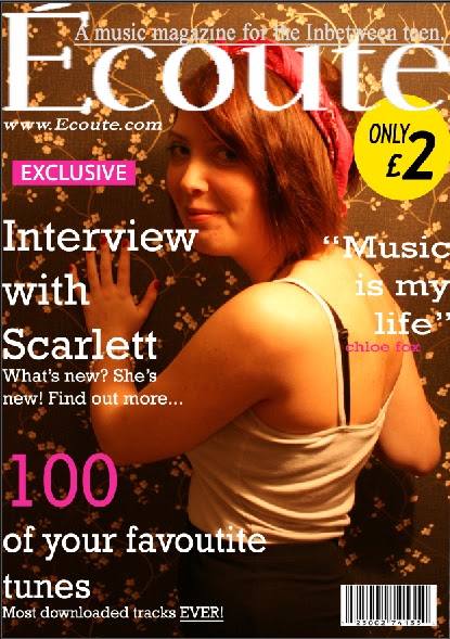
Final Front cover
This is my final magazine cover, I added much more text to it. I have focus on keeping it to simple coulours. I went with mainly white and pink because it matched the main cover image. However i did the sign in yellow as I wanted this to really stand out to the target audience. On the cover it shows that Écoute has it's own website. I have highlighted the word exclusive, putting it on a pink background because this is the sort of thing that will really draw the readers attention. 
Stages of making my magazine
 This is the first stage of my magazine. I choose the picture that I wanted to use and zoomed it in so that there is more focus on the image rather than the background. I aslo added in the heading which I made on dafont.com. Then I wrote in my strapline about the heading.
  This is the secound stage of making my magazine. I then added in a website below the heading. Also I made a price sign.
This is the third stage of my magazine. I added the barcode and all added all the text, this is not the finished image. To finish I added more and more text.
Subscribe to:
Posts (Atom)